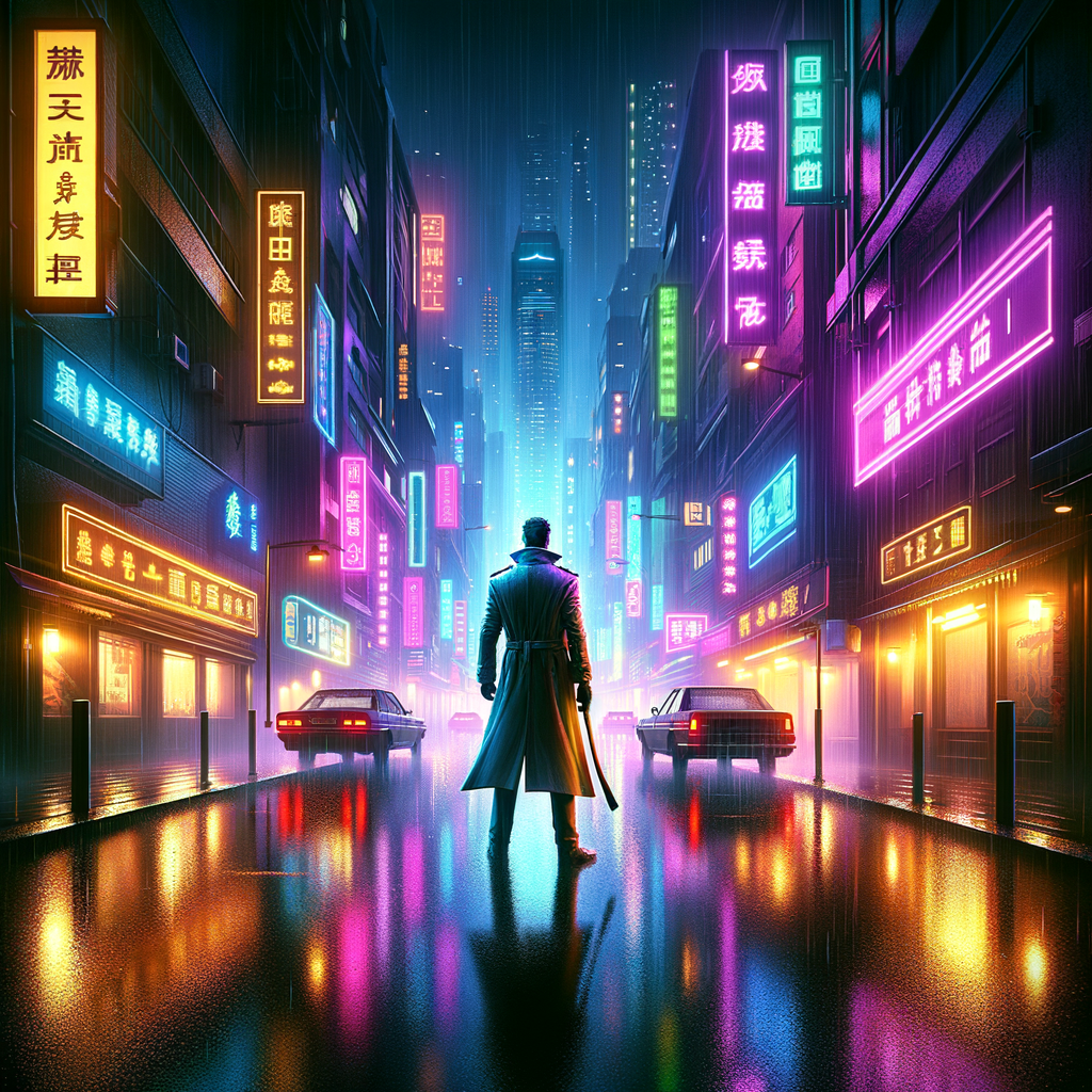
Max Payne, Two Decades Later: A Graphics Critique of a Neo-Noir Classic
Today in design, we revisit a landmark in video game aesthetics: the release of "Max Payne". On July 23, 2001, Remedy Entertainment introduced players to a gritty, noir-inspired world that redefined the visual language of interactive storytelling. Two decades on, we examine how its graphics shaped the direction of game design and what lessons remain relevant for creatives today.
What Happened
Twenty years ago, "Max Payne" made its debut with a distinctive visual palette and cinematic approach. Its design fused comic book panels with 3D environments, leveraging the graphical capabilities of the time to deliver a uniquely immersive experience. The game’s photorealistic textures, moody lighting, and signature "bullet time" effects set it apart from its peers.
The graphics employed a mix of pre-rendered backgrounds and polygonal characters, pushing then-current hardware to its limits. Remedy’s use of digital stills—photographs of real people mapped onto character models—created a surreal, hyper-real atmosphere. Environments were heavily detailed, with grimy New York streets, snow-laden rooftops, and interior spaces that evoked film noir classics.
Crucially, "Max Payne" integrated its narrative with its graphics. The story unfolded through stylized graphic novel panels, complete with heavy shadows and bold lines. This design choice not only compensated for technical limitations but also reinforced the game’s tone and storytelling ambitions. The seamless transition between gameplay and illustrated cutscenes gave players a sense of continuity rare for the era.
In retrospect, the game’s visual design stands as both a product of its time and a forward-thinking blueprint. While polygon counts and texture resolutions were low by today’s standards, the overall aesthetic—anchored by lighting, composition, and atmosphere—remains effective.
Why It Matters
"Max Payne’s" graphics were more than a showcase of technology; they were a deliberate artistic choice that influenced an entire generation of games. The title demonstrated how style and atmosphere could compensate for hardware constraints, a lesson still relevant for indie developers and AAA studios alike.
The integration of narrative and visual design foreshadowed trends in modern game storytelling, where seamless transitions and cohesive art direction are now standard. The game’s willingness to embrace its limitations—using stylized panels instead of fully animated cutscenes—illustrates the power of constraints in driving creative solutions.
Moreover, the game’s gritty realism paved the way for story-driven shooters and inspired titles across multiple genres. Its influence can be seen in everything from subsequent Remedy projects like "Alan Wake" to broader trends in interactive storytelling.
Key Stats
- "Max Payne" was released on July 23, 2001, selling over 7.5 million copies worldwide.
- The game used scanned photographs of real actors for character faces, a pioneering technique at the time.
- It featured over 80 unique graphic novel panels to deliver its story.
- The game’s "bullet time" mechanic was among the first real-time slow-motion effects in video games.
What's Next
As the industry continues to evolve, the legacy of "Max Payne’s" design is more relevant than ever. With remakes and remasters on the horizon, developers are revisiting classic aesthetics, blending modern technology with the lessons of the past. Expect continued innovation in narrative-driven design—where art direction and storytelling are inseparable—and a renewed appreciation for the creative solutions that defined early 2000s game graphics.
Looking ahead, the enduring appeal of "Max Payne" suggests that atmosphere, style, and narrative cohesion will remain central to the design of memorable interactive experiences.