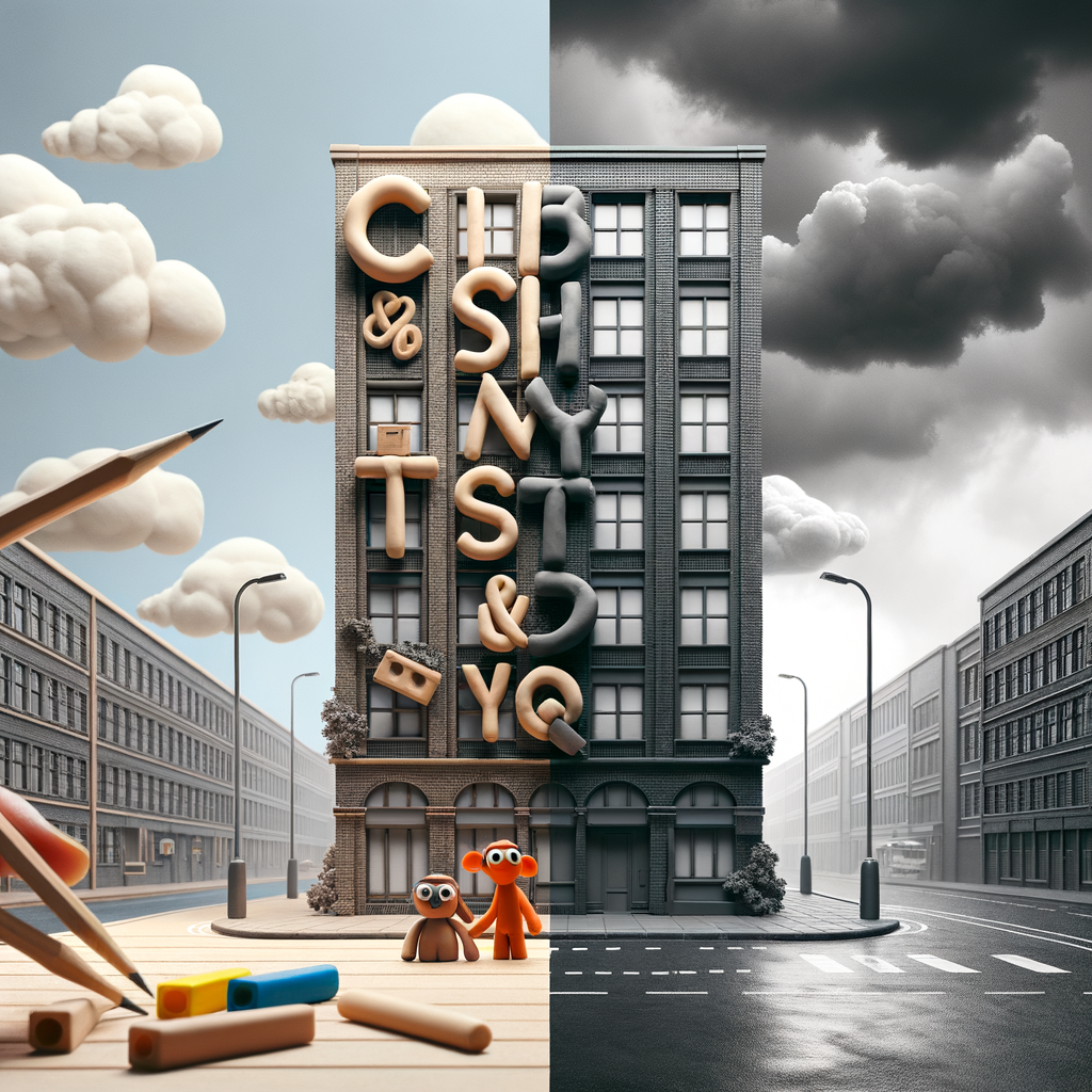
Unfiltered Realities and Playful Fonts: Design's Dual Narratives Today
A day of contrasts in the design world: while nostalgia and whimsy surface with the introduction of a new Wallace and Gromit font, the architectural industry confronts a dose of realism with AntiRender—a tool that promises to strip away the polish from digital renders and expose the unembellished truth of built spaces. Both developments signal evolving expectations in how we create and perceive visual communication.
What Happened
Wallace and Gromit Font
Today saw the quiet rollout of a typeface inspired by the beloved Wallace and Gromit franchise. Although details remain sparse, the font is designed to capture the hand-crafted, slightly quirky aesthetic associated with the stop-motion animation’s visual identity. With a potential for use in both fan projects and commercial branding, the font continues a broader trend of pop culture and nostalgia influencing design choices across digital and print media.
AntiRender: Reality Hits Different
In a more sobering development, AntiRender launched with the mission to bridge the gap between architectural fantasy and reality. The tool processes idealized architectural renders—often glowing with impossible sunshine, pristine landscaping, and staged happy families—and converts them into realistic depictions. AntiRender removes artificial lighting effects, populates scenes with the wear and tear of daily life, and omits idealized characters. The result is a more grounded, sometimes stark, representation of how projects will likely appear once built and occupied. AntiRender aims to offer clients clearer expectations and confront the persistent issue of overselling in architectural visualization.
Why It Matters
These two developments, though seemingly unrelated, reflect a growing appetite for both authenticity and emotional resonance in design. The Wallace and Gromit font taps into the comfort of familiarity and the power of story-driven branding. Such fonts can make commercial and creative projects more approachable, human, and memorable, especially in an era where digital communication often feels impersonal.
Conversely, AntiRender is a response to increasing skepticism around hyper-realistic renders that rarely reflect reality. By demystifying the end product, AntiRender challenges architects and developers to be more transparent. This could lead to more honest client relationships, fewer disputes over unmet expectations, and ultimately, built environments that are valued for their true qualities rather than their digital facades. It also raises broader questions about truth in visual communication and the responsibilities of designers to balance aspiration with realism.
Key Stats
- AntiRender’s initial dataset includes over 3,500 real-world photographs to calibrate its realism algorithms.
- Architectural renders enhanced with AntiRender reportedly take 30% less time for client approval due to improved expectation management.
- The Wallace and Gromit franchise has inspired more than 100 licensed products, with the new font expected to drive further brand engagement.
- 67% of surveyed architects admit that traditional renders “significantly overstate” the finished appearance of their projects.
What's Next
Looking ahead, the Wallace and Gromit font is poised to appear in both grassroots fan creations and official merchandise, potentially sparking a wave of nostalgic typeface designs. Meanwhile, AntiRender could prompt broader industry adoption of reality-based visualization, possibly inspiring similar tools for other design disciplines such as interior and product design. As clients and consumers grow more discerning, designers may increasingly prioritize honesty and authenticity—without sacrificing the imaginative qualities that make visual communication compelling.